How to choose a Squarespace template before you fall in love with the demo
You open a template demo and immediately see the business you want to become.
The photography is impeccable. The services have perfect names. Every testimonial fits neatly into its assigned space. The copy is brief, confident, and suspiciously free of awkward details. Even the imaginary founder seems to have picked the right outfit for the footer.
It is easy to think, This is the one.
Then you start adding your actual business.
Your three signature services become nine treatment options. Your short biography needs room for credentials and your approach. Your booking process needs more explanation than a single button. The elegant pricing section stops looking elegant once real package names, session lengths, and payment details enter the picture.
The problem usually is not the template. It is the way the decision was made.
The right Squarespace template is not the demo that best matches your preferred style. It is the design that can hold your business structure, guide your customers toward the right decision, and keep working as your content and services evolve.
Style matters. It just should not be the first thing you test.
Start with your business, not the demo business
Every template demo contains an implied business model. One may be built around a single flagship offer. Another may assume customers already understand what they need. A third may lean heavily on a portfolio, treatment menu, personal brand, or consultation process.
Before comparing colors, fonts, or photographs, write down how your own business works:
What you sell
Who each service is for
How customers decide between your offers
Whether you display pricing
How someone books, buys, applies, or inquires
What questions must be answered before they act
What evidence helps them feel comfortable
Which parts of the business may grow in the next year
This gives you a practical standard for evaluating a template. Instead of asking, "Do I like this?" you can ask, "Can this support the way my customers choose and buy?"
That question will tell you more than any demo ever will.
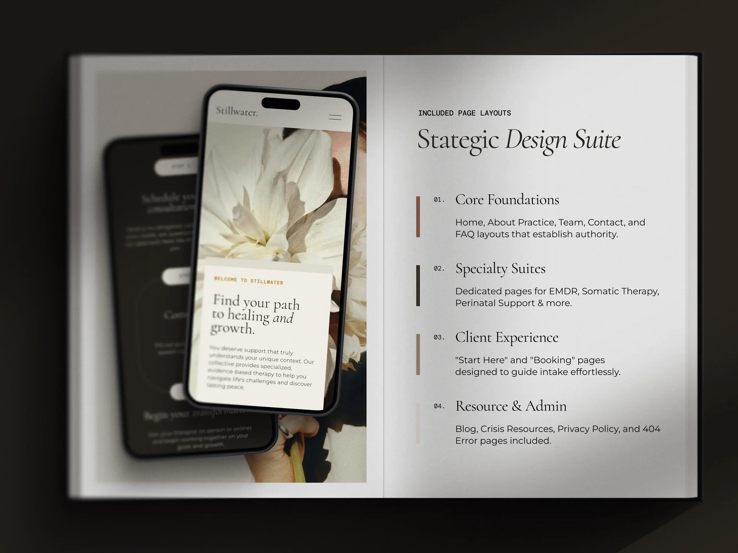
List the pages you actually need
A template can look expansive while containing surprisingly few useful page types. A long homepage is not the same as a complete website.
Start with a simple page inventory. A service business may need:
Home
About
Services overview
Individual service pages
Pricing or packages
Portfolio, gallery, or results
Testimonials
FAQ
Contact
Booking or inquiry information
Policies
Not every business needs every page. A solo consultant with one focused offer may need a compact site. A medspa with multiple treatment categories will usually need more room for service education and navigation. A photographer may depend on portfolio pages, while a therapist may need to explain approach, specialties, logistics, and fit.
Look beyond the demo's navigation. Open every page included with the template and ask whether its underlying structure can serve one of your real needs. A page labeled "Portfolio" might work as a treatment-results gallery. A "Process" page might become a clear explanation of what happens before, during, and after a consultation. You are evaluating the structure, not the demo label.
Match the demo's content volume to your own
Templates look their best when the amount of content matches the design. If the demo uses one short sentence beneath each service, but your customers need a full explanation of eligibility, preparation, timing, and next steps, that layout will strain. If you have only three strong photographs, a design built around image-heavy galleries will leave you searching for filler.
Figure out your content volume before you choose. How detailed are your service descriptions? Do you need to explain a distinctive method? Are there credentials, policies, or practical details customers expect to find? Do you have several offers that require comparison? Will you publish educational content?
Count the images you can genuinely use, too. A photography-led template needs a strong, coherent image library. Repeating three photographs across an entire site will make even a beautiful design feel thin. Choose for the assets you have or have concrete plans to produce, not the imaginary brand shoot happening at some undefined point in the future.
Make sure the service structure fits
Service businesses organize offers in very different ways. A stylist might offer cuts, color, extensions, and treatments. A coach may have a private program, an intensive, and a lower-commitment consultation. A creative studio may need to separate strategy, design, and ongoing support. A medspa may organize treatments by concern, technology, or treatment area.
Check how the template handles one service versus many, service categories, individual service pages, packages or tiers, add-ons, related services, repeated calls to action, and long and short descriptions.
If you offer several services, customers should be able to understand the hierarchy without reading the entire website. The design should help them move from broad category to specific offer without getting lost.
In our experience, clients rarely arrive using the exact professional language a provider would use. They arrive with a concern, a desired outcome, or a vague sense that something is not working. A useful website has to meet them there. Your service structure should help customers recognize themselves before asking them to choose the correct industry term.
Decide how pricing should appear
Pricing is not just a copy decision. It affects layout. You may need to display a single starting price, several fixed prices, package comparisons, session lengths, deposits or payment schedules, "starting at" language, custom-quote information, what is included, or optional upgrades.
Look closely at the demo's pricing sections. Do they still work when you replace the polished placeholder content with your actual details? A three-column pricing table may be perfect for three coaching packages and completely wrong for a treatment menu with twenty services. Do not force your pricing model into a layout just because the demo version looks tidy.
Trace the booking or inquiry path
A website should make the next step clear, but that next step is not identical for every business. Some customers can book immediately. Others need to schedule a consultation, complete an application, request availability, or send an inquiry first.
Write down the correct path for each major offer:
Customer finds the relevant service.
Customer gets enough information to determine basic fit.
Customer reviews pricing, process, or FAQ.
Customer books, applies, or contacts the business.
Now test whether the template supports that path. Look for calls to action in the places where a customer is likely to make a decision. Check whether individual service pages can lead somewhere specific. Make sure the design does not depend on one generic "Learn More" button repeated everywhere.
A customer considering a sensitive wellness service may need more context before booking than someone buying a clearly defined consultation. Your template should leave room for the amount of trust-building that decision requires.
Inspect the live demo on your phone
Do not choose a website template from a desktop preview alone.
Open the live demo on your phone and move through it as a customer would. Do not just admire the homepage. Try to locate a service, understand the offer, find pricing, and reach the booking or contact step. Pay attention to section order, heading and paragraph lengths, button placement, navigation clarity, image crops, scrolling required, whether important information appears early enough, and whether decorative sections interrupt the decision path.
Desktop layouts can place text and images side by side. On a smaller screen, those elements form a sequence, and the order becomes part of the message. You are not looking for a demo that needs no changes. You are checking whether its basic hierarchy still makes sense when the available space changes.
What to inspect before you buy
When reviewing a live demo, use this practical checklist:
Structure
Does it include or support the pages you need?
Can customers distinguish between your services?
Is there room for your real amount of copy?
Does the visual emphasis match the assets you have?
Customer journey
Can a visitor quickly find the right offer?
Is the next step clear on important pages?
Are questions and trust concerns addressed before the call to action?
Mobile
Does the section order still make sense?
Are pages easy to scan?
Do image-heavy sections become unnecessarily long?
Longevity
Can you add realistic future services or content?
Will the navigation remain understandable?
Does the design rely on a content format you cannot maintain?
If a template passes these tests and you still love the visual direction, you have found a much stronger candidate.
Choose the framework first, then make it yours
A template is a starting framework, not a personality transplant. Colors, type choices, images, copy, and smaller layout decisions can change the character of a website substantially. The harder problems are structural: whether the pages fit your business, whether services are easy to understand, and whether customers can move from interest to action without unnecessary confusion.
Choose with your customer journey first and your visual preferences second. You are not ignoring taste. You are giving it a structure that can actually hold the business.